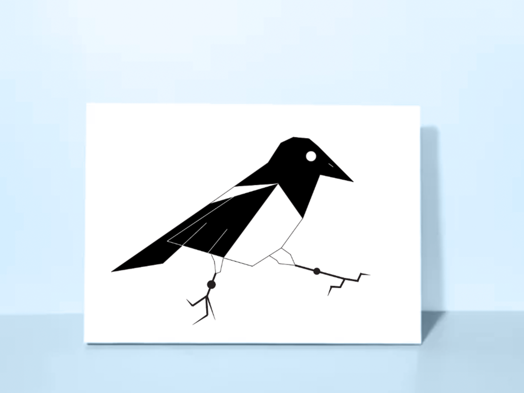
The goal of this project was to redesign an LP cover for an chosen music artist by incorporating photography and type while still reflecting the music from the album. Album design is to be more geared towards their target audience, young people who are college students who are uncertain about their future.
Original LP
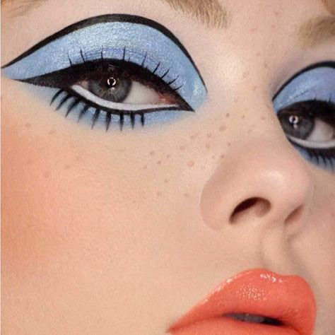
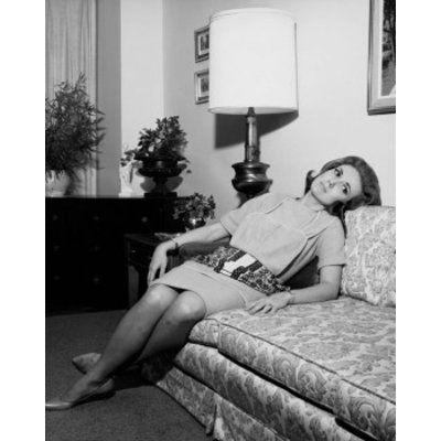
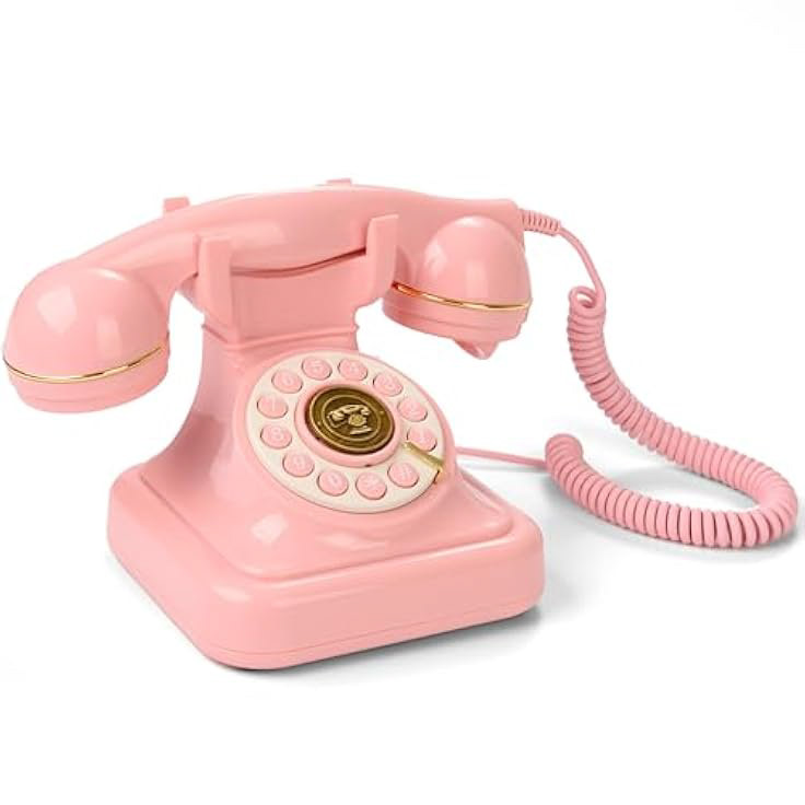
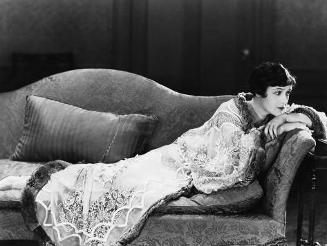
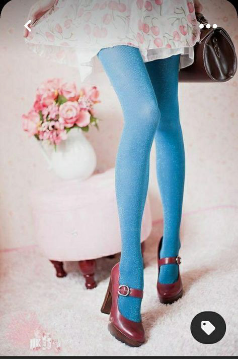
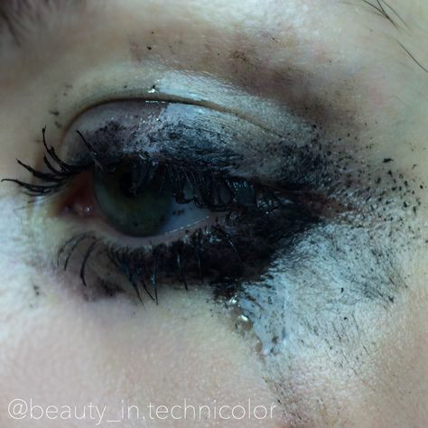
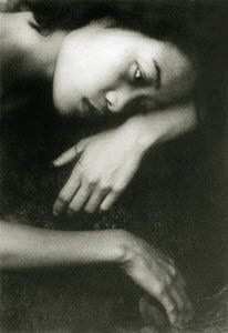
Inspiration Board
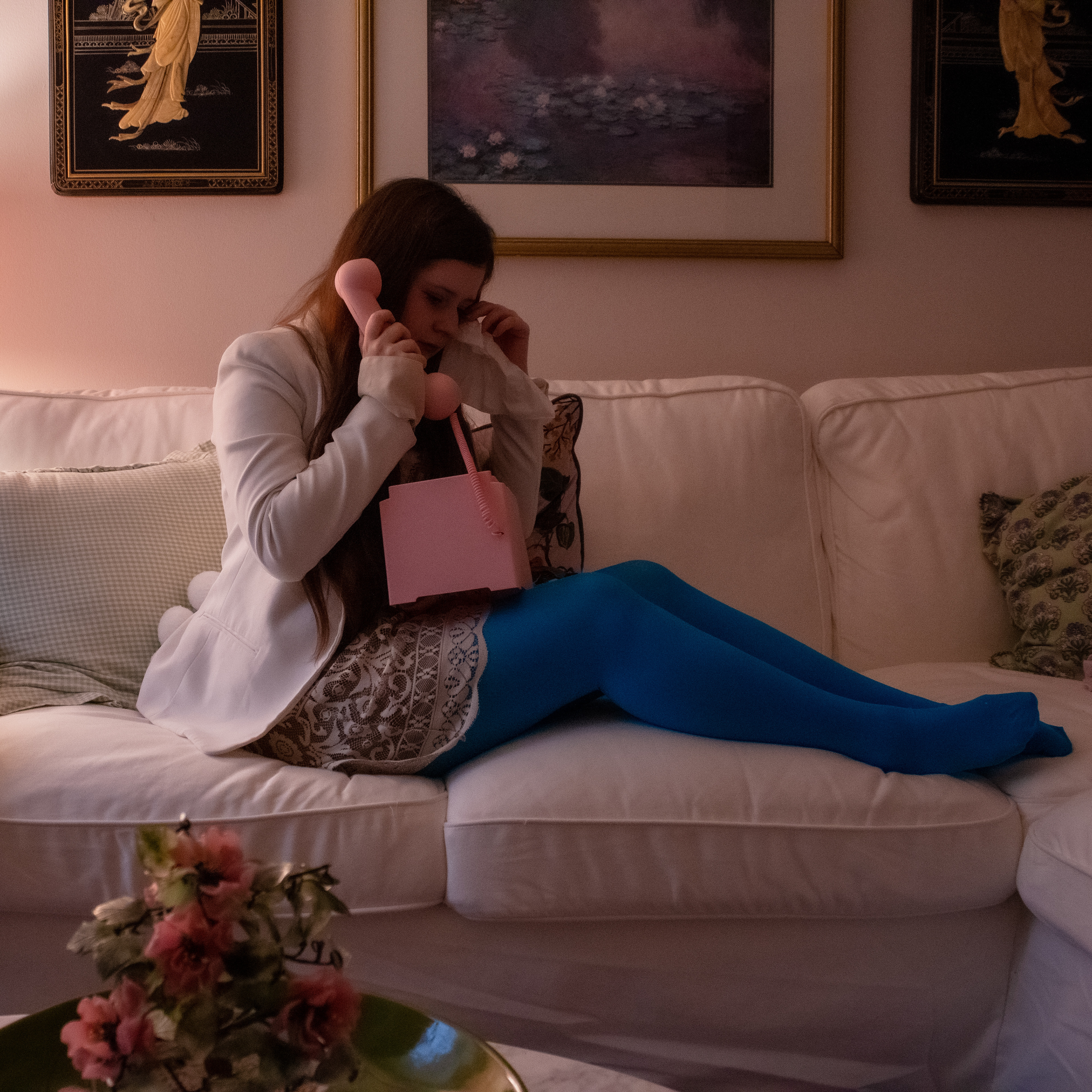
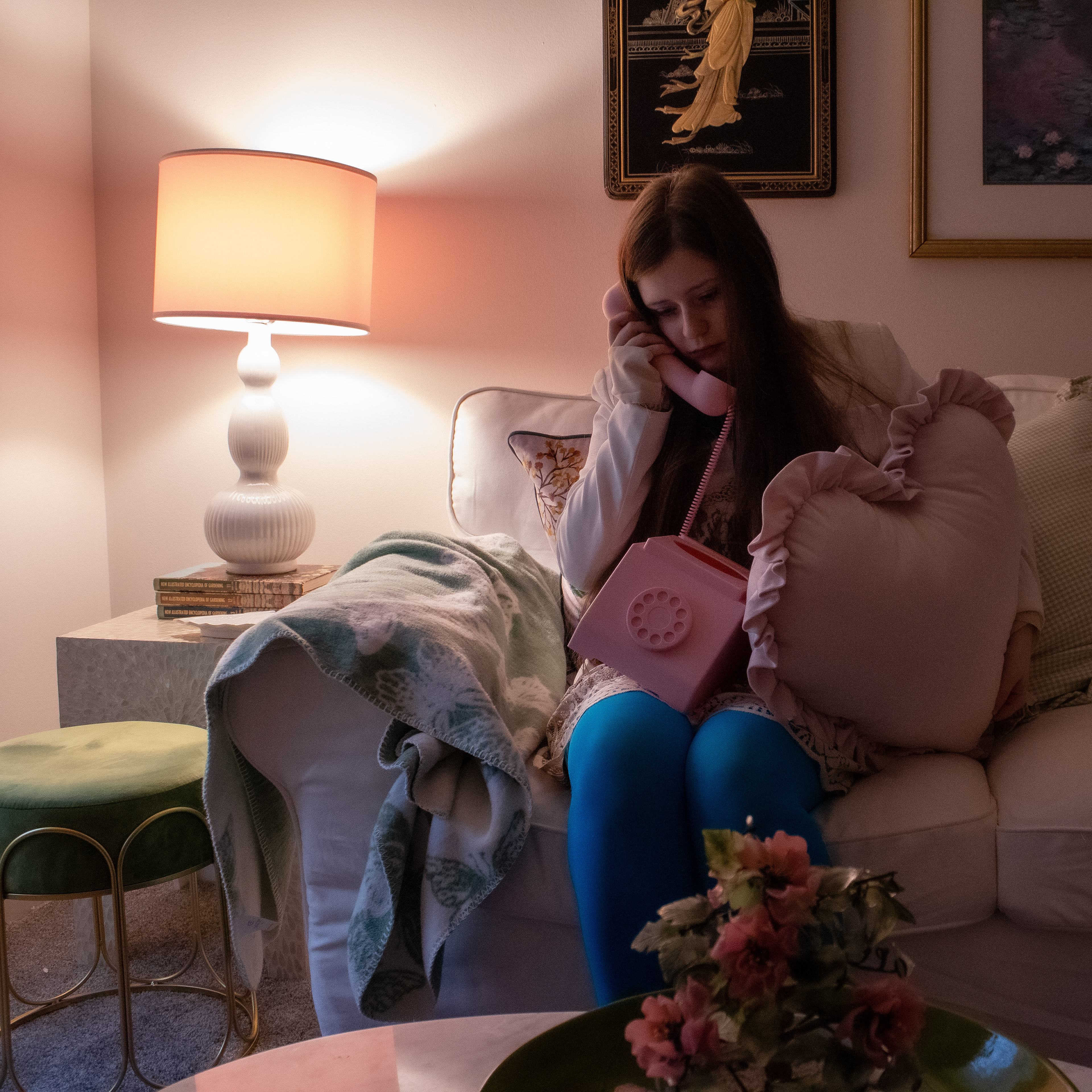
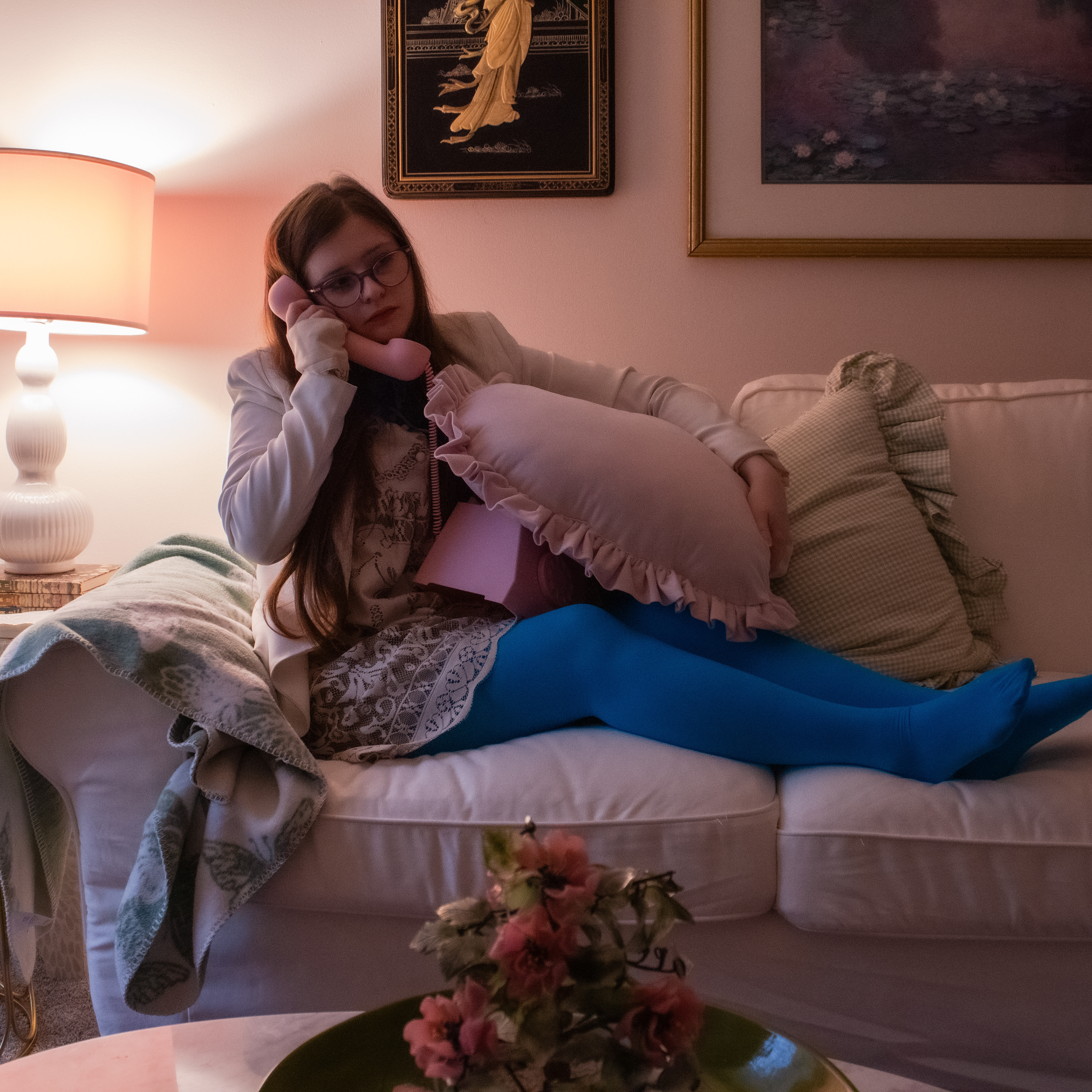
The theme for this redesign was to enhance the feelings of loneliness and turbulence in all of one person's relationships.
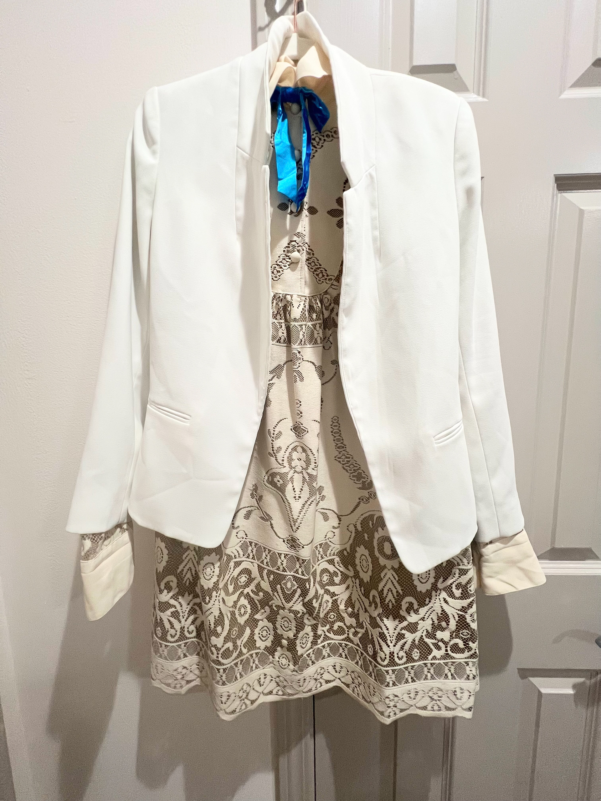
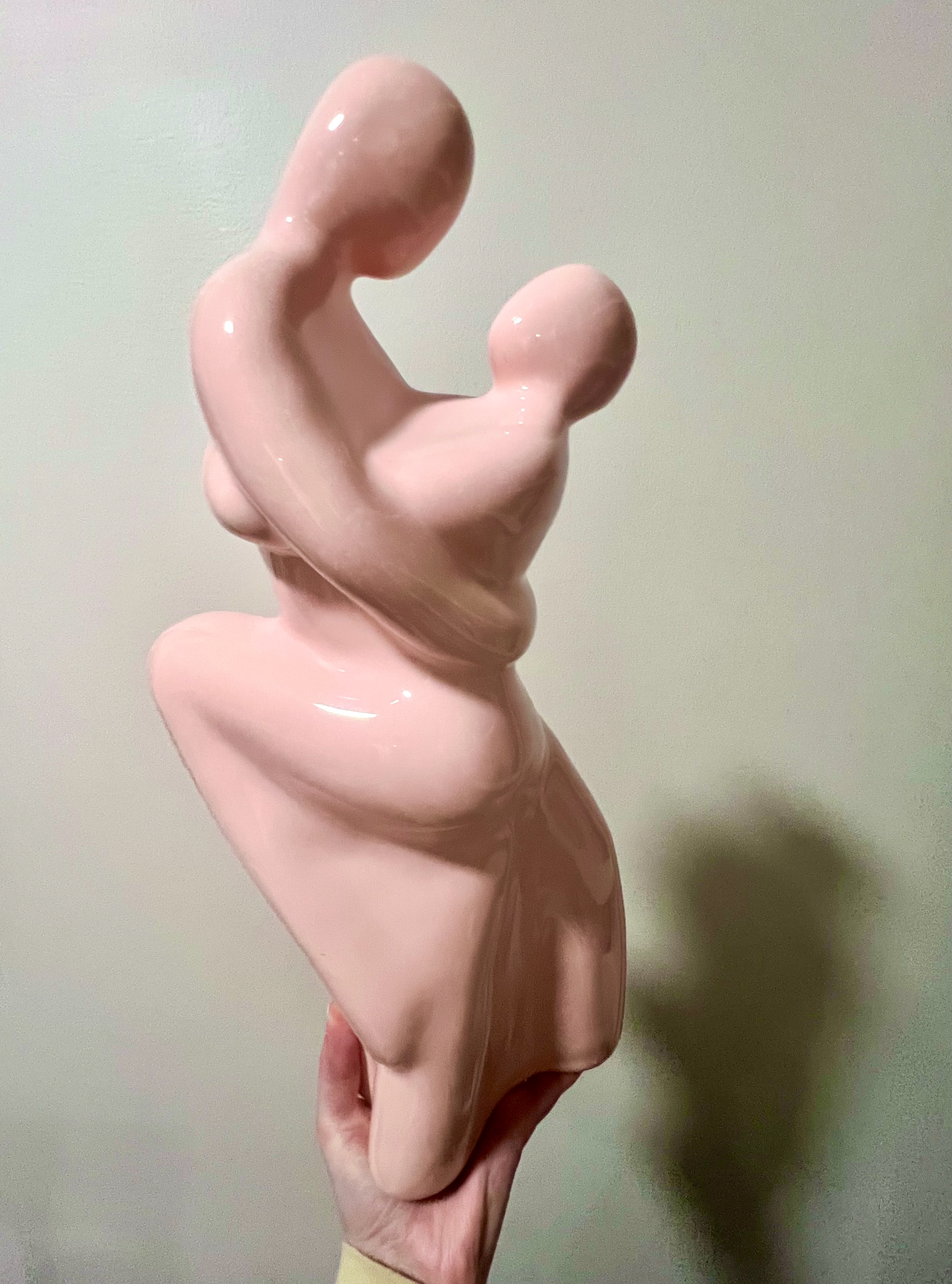
Sketching
Sketches were produced to get an understanding of compositions before shooting.
Photo Iterations
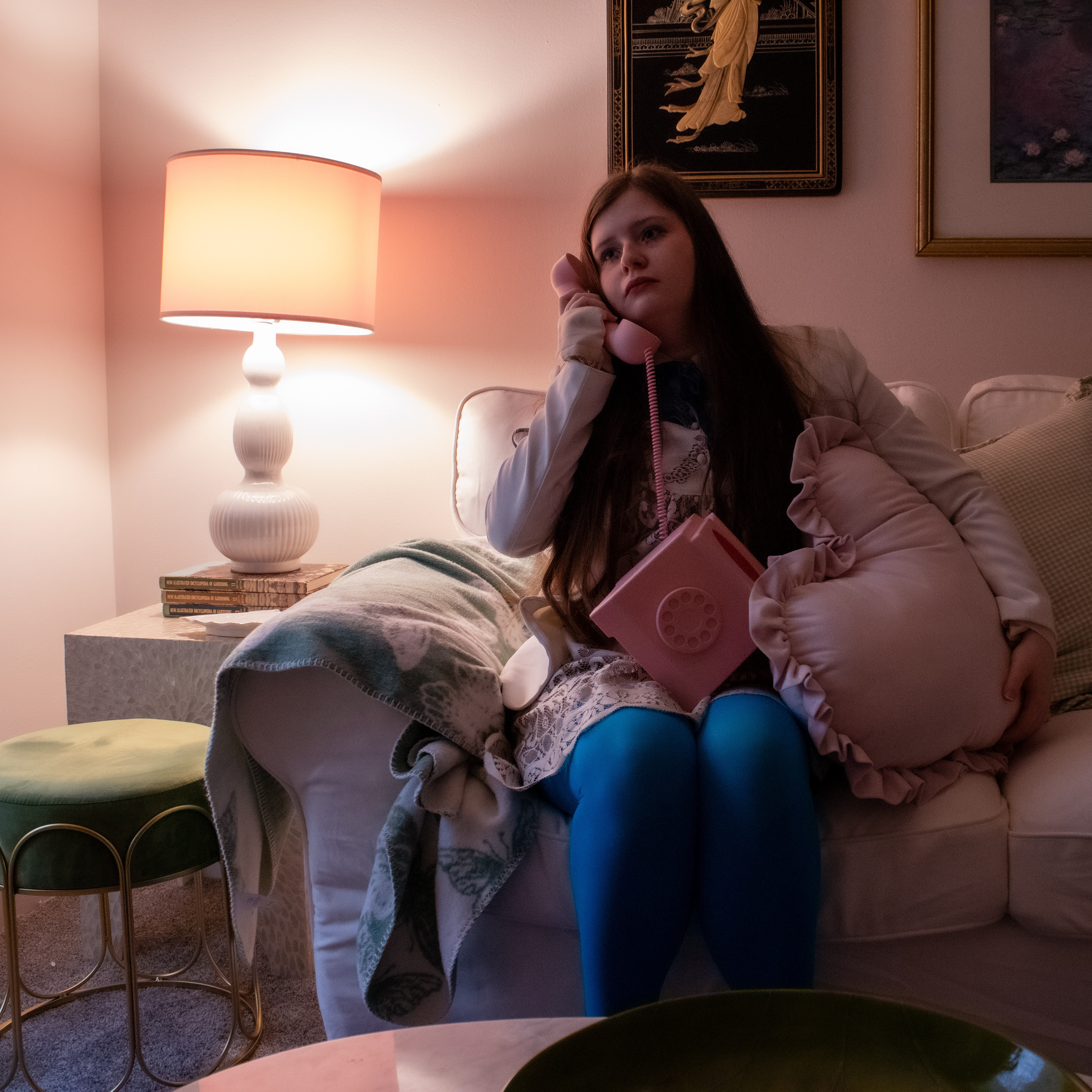
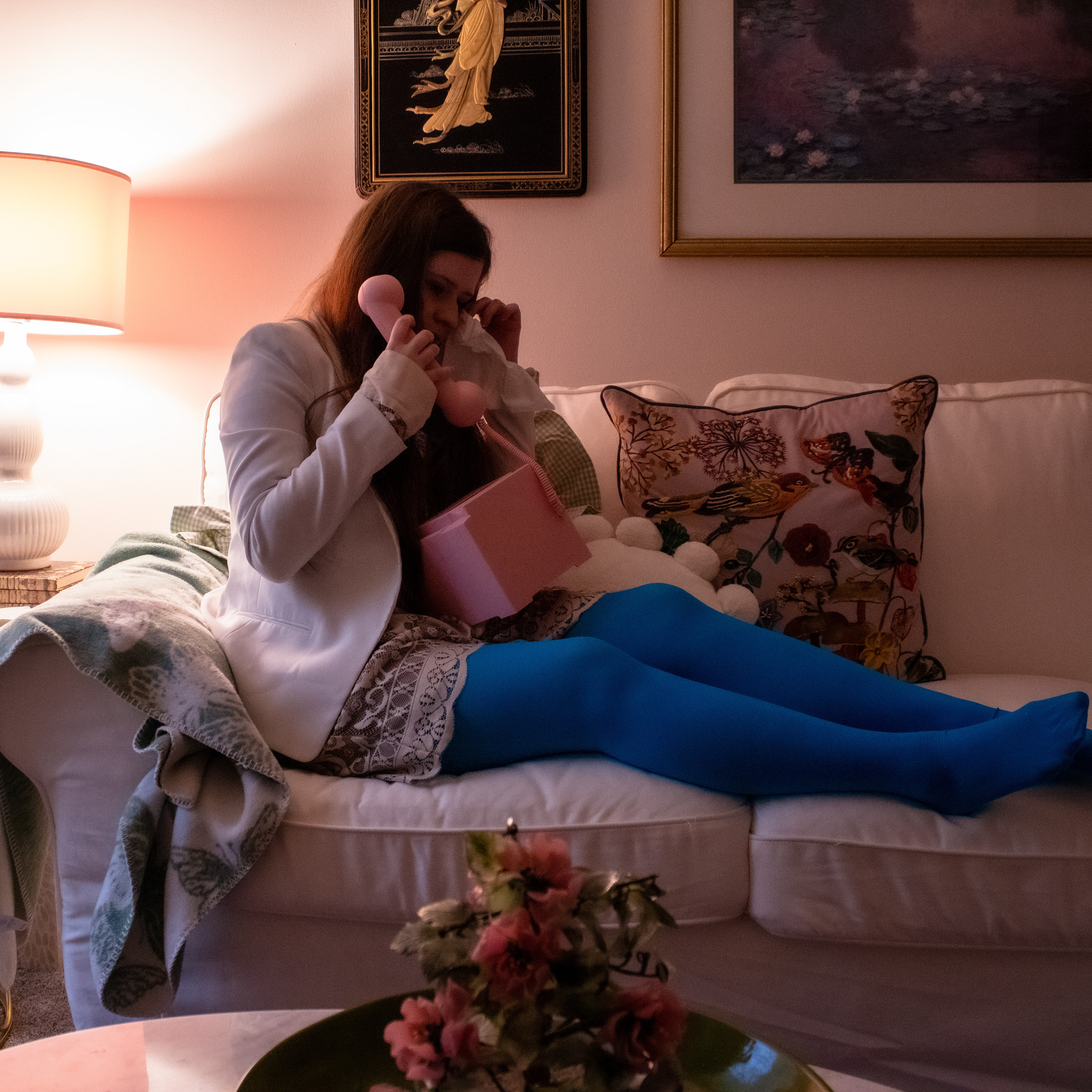
Typographic Studies
Playing with different fonts. Tried to combine more than one typeface making combinations with calligraphic, serif, and sans-serif.
Color Studies
LP
The overall design has a mix of 1960s-1970s aesthetics, with moody lighting to convey the isolation young people may face as they transition to adulthood. Composition wise, the photo is supposed to capture the main subject while including some of the background to empathize the subject is depressed and isolated.

